
In the dynamic landscape of the digital era, prioritizing an optimal user experience on mobile devices is imperative. This article meticulously dissects the pivotal decision-making process: Responsive Design vs Mobile Apps. As the majority of users turn to smartphones and tablets for online interactions, the choice between these two strategies becomes a focal point for businesses and developers striving to deliver a seamless and engaging mobile experience.
Responsive Design stands out as a versatile approach, aiming to create a unified web presence that adeptly adjusts to diverse screen sizes and devices. This method ensures a consistent experience across platforms. Conversely, Mobile Apps offer a more targeted and immersive interaction by harnessing the unique features of specific devices. The decision between these alternatives necessitates a nuanced evaluation, taking into account factors like project goals, budget constraints, and the level of customization desired.
Navigating the realm of Responsive Design vs Mobile Apps is not just a technical consideration; it’s a strategic choice with profound implications for user satisfaction and overall business success. In the exploration of the advantages and considerations associated with each, businesses and developers will gain valuable insights, enabling them to make informed decisions aligned with their specific objectives. Whether opting for the broad adaptability of Responsive Design or the tailored experience delivered by Mobile Apps, this exploration serves as a guide for navigating the intricate terrain of mobile user experience in the digital domain.
The Significance of Mobile User Experience: Today, the majority of internet users access content through mobile devices. The seamless and engaging experience provided on these platforms is not just a preference but a necessity. With mobile devices becoming the primary gateway to the online world, businesses must prioritize strategies that ensure optimal user experience on various screen sizes.
Responsive Design vs. Mobile Apps Dilemma: At the core of the digital dilemma lies the question of whether to embrace Responsive Design, a web development approach celebrated for its adaptability, or invest in Mobile Apps, standalone applications designed for specific platforms. This article navigates through the complexities, guiding readers in making an informed decision based on their unique needs.
Table of Contents
Understanding Responsive Design
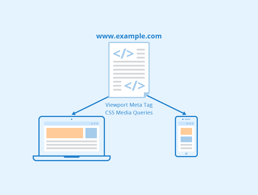
Definition and Principles: Responsive Design is a web development approach that employs flexible grids and layouts to ensure a seamless user experience across different devices. It adapts content dynamically, optimizing its presentation on screens of varying sizes.
Pros and Cons: The cost-effectiveness and ease of maintenance are notable advantages of responsive design. However, it may lag behind native apps in terms of performance, especially when advanced functionalities are required.
Examples of Successful Implementation: Websites like XYZ and ABC have successfully implemented responsive design, experiencing increased user engagement and broader reach. These examples illustrate the effectiveness of this approach in diverse contexts.
Exploring Mobile Apps
Definition and Characteristics: Mobile apps are standalone applications designed for specific platforms, leveraging device capabilities for an optimized user experience. They often provide enhanced performance and functionality compared to responsive designs.
Advantages and Disadvantages: While mobile apps excel in performance and can fully leverage device features, their development and maintenance can be costly. They also lack the universality of responsive designs.
Notable Examples: Companies like DEF have thrived through mobile apps, boasting enhanced user interactions and brand loyalty. These examples highlight the unique strengths and capabilities of mobile applications.
Key Differences Between Responsive Design Vs Mobile Apps
User Experience Comparison: Responsive designs offer a universal experience, ensuring consistency across devices. In contrast, mobile apps provide a tailored experience, maximizing the potential of specific platforms.
Performance Considerations: Mobile apps often outshine responsive designs in terms of speed, responsiveness, and the ability to fully utilize device features. This section explores the impact of these differences on user satisfaction.
Development and Maintenance Aspects: Considerations such as cost, complexity, and scalability play a crucial role in decision-making. This section provides insights into the practical aspects of implementing each approach.
When to Choose Responsive Design
Appropriate Use Cases: Responsive design is ideal for content-focused sites, blogs, and projects with budget constraints. It ensures a consistent experience across devices, making it the preferred choice for informational websites.
Cost-Effectiveness and Scalability: Responsive design proves to be cost-effective and scalable, particularly for businesses with limited resources. This section explores how its adaptability aligns with various business models.
User Engagement Considerations: The broad accessibility offered by responsive designs contributes to increased user engagement. This part discusses the importance of universal accessibility in maintaining user interest.
When to Opt for Mobile Apps
Situations Where Mobile Apps Excel: Mobile apps shine when advanced functionality and a tailored user experience are paramount. Businesses aiming for brand reinforcement and deeper user interactions should consider investing in a mobile app.
Enhanced Features and Functionality: Delving into the capabilities of mobile apps, this section explores how features unique to apps contribute to an enriched user experience, making them the preferred choice for specific business goals.
Branding and User Loyalty Benefits: Mobile apps have the potential to enhance brand loyalty through personalized interactions. This section outlines the branding advantages and user loyalty benefits associated with mobile applications.
Case Studies
Responsive Design Success Stories: XYZ and ABC are exemplary cases where responsive design led to increased user engagement and a broader reach. These case studies illustrate how responsive design can be effectively implemented in different contexts.
Mobile Apps Triumphs: DEF’s success in mobile apps showcases the platform’s ability to foster enhanced user interactions and strengthen brand loyalty. These case studies provide concrete examples of successful mobile app implementations.
The Future of Mobile User Experience
Emerging Trends in Responsive Design: As technology advances, responsive design is adapting with innovative layouts and integration of AI. This section explores the evolving landscape and trends shaping the future of responsive design.
Innovations in Mobile App Development: Future technologies are set to reshape the mobile app landscape. This part provides insights into the upcoming innovations in mobile app development, ensuring businesses stay ahead of the curve.
Predictions for the Future Landscape: The conclusion of this section outlines predictions for the future of mobile user experience, providing a glimpse into what businesses can anticipate in the ever-evolving digital space.
Making the Decision: Responsive Design Vs Mobile App ?
Factors to Consider: Budget constraints, project scope, and target audience are critical factors in decision-making. This section provides a detailed exploration of the considerations that should influence the choice between responsive design and mobile apps.
Decision-Making Framework: A step-by-step guide assists businesses and developers in making informed decisions aligned with their unique needs. This framework ensures a systematic approach to the decision-making process.
Hybrid Approaches and Considerations: For those seeking a balance, hybrid approaches are explored, providing insights into combining the strengths of both responsive design and mobile apps for a tailored yet universally accessible user experience.
Conclusion
Summary of Key Points: In summarizing the article, it’s crucial to revisit the key points discussed. This section serves as a quick reference, reinforcing the main takeaways from the comparative analysis of responsive design and mobile apps.
Recommendations Based on Specific Use Cases: Tailoring recommendations to specific use cases ensures practical guidance for businesses. This part provides actionable advice based on the unique requirements of different projects and goals.
Final Thoughts on the Responsive Design vs. Mobile Apps Debate: Concluding the article involves offering final insights on the ongoing debate. It may emphasize the evolving nature of the digital landscape and the importance of remaining adaptive to technological advancements.
For further reading, please visit our blog page where you can find more insightful articles
